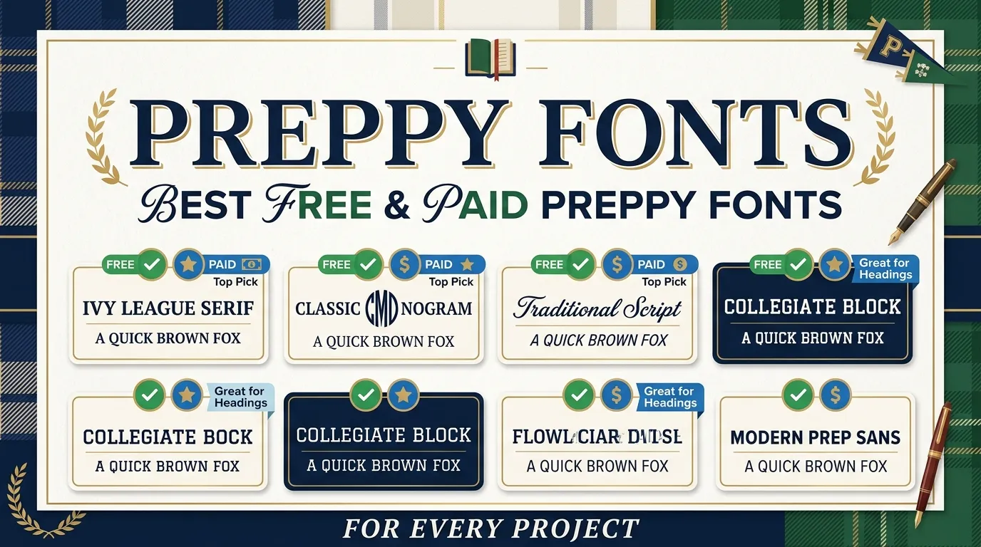
Preppy Fonts: Best Free & Paid Preppy Fonts for Every Project
There’s something unmistakable about a design that just feels polished. The kind that makes you stop mid-scroll, register the brand, and instantly associate it with quality. More often than not, that impression is built on typography – and specifically, the kind of typography that draws from a long tradition of class, leisure, and considered style. That’s exactly where preppy fonts live.
Whether you’re building a lifestyle brand, designing wedding stationery, crafting an Instagram aesthetic, or pulling together a Canva template for a fashion label, understanding preppy typography is one of the most practical creative skills you can develop.
What Exactly Are Preppy Fonts – and Why Do They Work So Well?
“Preppy” as a design descriptor traces back to the Ivy League and New England prep school culture of mid-20th century America. The aesthetic – think nautical stripes, monograms, collegiate crests, and tasteful restraint – extended naturally into typography. Preppy fonts borrow the same visual language: refined, intentional, and effortlessly elegant without being fussy.
What makes a font “preppy”? There’s no single defining trait, but the category tends to share a handful of characteristics:
- Structure with warmth – even when a font is formal, it carries an approachability
- Heritage-influenced design – many preppy typefaces echo editorial typography from mid-century fashion magazines
- Clean lines with personality – neither too cold nor too casual
- Versatility across mediums – they work as logo design fonts, website fonts, social media fonts, and print equally well
This is why preppy aesthetic fonts have become a go-to for lifestyle branding, fashion typography, and any visual branding project that needs to communicate sophistication without alienating the audience.
If you’re just getting familiar with the broader world of preppy style and what anchors its visual identity, Preppyglow offers a solid grounding in the lifestyle and aesthetic that informs this entire design category.
The Four Core Categories of Preppy Typography
Before diving into specific fonts, it helps to understand the structural categories that make up preppy typography. Different projects call for different voices – and knowing which font style to reach for changes everything.
Script and Cursive Fonts: Laid-Back Luxury in Every Letter
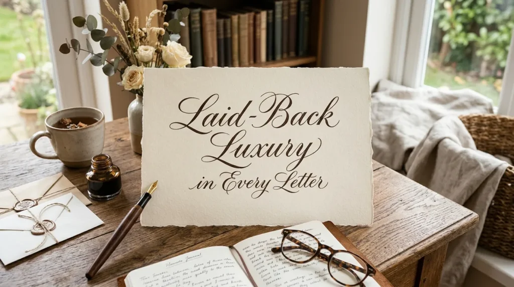
Script fonts are arguably the heart of preppy design. They evoke handwritten correspondence, monogrammed linens, and the kind of brand identity that feels personal even at scale. The best preppy script fonts manage to feel relaxed and luxurious simultaneously – no easy feat.
ED Lavonia is a strong example. It has that swooping, ink-on-paper quality that reads immediately as both casual and refined. The slight irregularity in its letterforms is the point – it feels human, not mechanical.
Luminaire takes a slightly more editorial approach. With higher contrast strokes and more pronounced ascenders, it’s one of those aesthetic fonts that photographs particularly well – ideal for logo design or any application where the font needs to hold up as a visual element in its own right.
NCL Amhiney sits in interesting territory: it’s a script font that has enough structure to work in body-adjacent roles. Short taglines, product labels, even section headers in digital design benefit from its balance of flow and legibility.
Madville is worth knowing if you need something with warmth. It’s one of those handwritten fonts that doesn’t read as childish but still feels immediate and personal. For fonts for invitations or social media design where you want intimacy without informality, Madville delivers.
Seasons leans into the lifestyle branding space effectively. Its rhythm has a certain coastal, clean quality – the typographic equivalent of a well-worn dock bag or a pressed linen shirt.
Oranges and Lemons Font Duo deserves special mention because it actually gives you two fonts engineered to work together – a script and a complementary secondary face. Font pairing is one of the trickier parts of typography design, and a duo takes that guesswork out of the equation entirely.
Handwritten Preppy Fonts: Personal, Elegant, and Unmistakably Chic
There’s a meaningful distinction between a script font and a handwritten font, even if the terms often get conflated. Script fonts typically have formal origins and consistent stroke structure; handwritten fonts deliberately replicate the irregularity of pen on paper. Both have a place in preppy branding – but they do different jobs.
Pink Champagne is a beautiful example of a handwritten font that carries genuine elegance. The letterforms have that slightly imperfect quality that makes a brand feel human and considered. It’s a strong choice for feminine fonts applications – beauty brands, boutique fashion labels, editorial headers.
Club Tropicana plays with the overlap between handwritten aesthetic and vintage display fonts. It has a retro coastal energy that works well for brands straddling the line between nostalgia and modern preppy sensibility.
Beach Bound leans more casual – still very much in the preppy aesthetic fonts family but with an ease that makes it feel approachable. For social media fonts and Instagram content especially, this is the kind of typeface that photographs well and scales cleanly.
The Silver Editorial is where handwritten meets high fashion. If your brand lives in a space adjacent to luxury publications, this font adds genuine editorial weight. It’s the typography equivalent of serif gravitas, delivered through handwritten form.
Things is a more understated option – almost architectural in its simplicity while still clearly handcrafted. It pairs well with sans serif fonts for a clean, modern look that still has personality.
Very Vogue does exactly what the name suggests. The letterfoms are dramatically proportioned in that high-fashion way – tall ascenders, thin strokes – which gives it a distinctive silhouette at display sizes. Excellent for logo design in the fashion typography space.
Clean Heart rounds out this category with a font that manages softness without being saccharine. It’s the kind of aesthetic font that works for wellness brands, stationery, and digital design where a soft aesthetic is the goal.
Preppy Serif Fonts: Timeless Elegance with Real Structural Authority
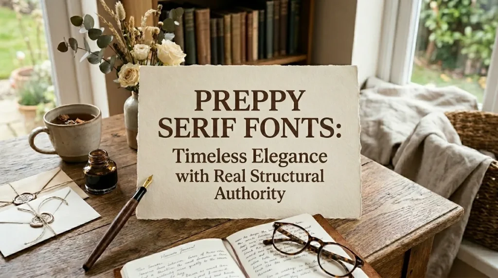
Serif fonts are the typographic backbone of classic and timeless font design. The small strokes at the end of each letterform carry centuries of print heritage – which is exactly why they work so well in preppy branding. They communicate permanence, authority, and craft.
Within the preppy design space, the best serif fonts tend to be:
- High contrast – thick and thin strokes that create visual rhythm
- Editorial in origin – many draw from 20th-century magazine typography traditions
- Balanced in weight – not so heavy they feel corporate, not so light they disappear at small sizes
When used for fonts for logos or website fonts in the preppy space, serifs carry a visual weight that sans serifs simply can’t replicate. They’re the typography choice for brands that want to communicate history, even if the brand itself is brand new.
Clean Sans Serif Preppy Fonts: Modern Elegance Without the Ornamentation
There’s a misconception that preppy typography has to lean heavily on serifs and script. In practice, some of the strongest modern preppy fonts are sans serifs – because clean typography communicates confidence, and confidence is inherently preppy.
Metro Sans is a workhorse here. It has the geometric precision of a modern sans serif with enough personality to feel curated rather than generic. For digital design, fonts for websites, and anywhere you need legibility at multiple sizes, Metro Sans delivers.
Eloquia is more refined – a sans serif with proportions that feel almost editorial. Its letter spacing and x-height give it a luxury aesthetic that makes it feel at home in high-end branding contexts, even without a single serif.
Modern sans serif preppy typography tends to work best in combination with a script or handwritten accent font. The contrast between the two creates visual interest while maintaining the clean and minimal typography style that defines contemporary preppy design.
Building a Preppy Font Palette: Font Pairing Ideas That Actually Work
Choosing one font is hard enough. Choosing two or three that work together while maintaining a cohesive preppy aesthetic is where many designers stall. Here’s a practical framework:
Combination 1: Script + Serif Use a flowing script for headers or brand name, a classic serif for body text and subheadings. The contrast is dramatic but balanced. Think: Luminaire over a traditional editorial serif for a fashion brand.
Combination 2: Handwritten + Sans Serif This is the most modern pairing in the preppy space. The handwritten element adds warmth and humanity; the sans serif provides clean structure. Very Vogue paired with Metro Sans, for example.
Combination 3: Display + Serif + Sans For complex brand systems – websites, packaging, editorial – a three-font system gives you flexibility. A display or script for hero moments, a serif for headers, a sans serif for body copy. Eloquia as body, a serif as secondary, and a script as accent works beautifully.
The key rule: don’t pair two fonts of the same category. Two scripts, two serifs, two sans serifs together – it creates visual noise rather than contrast.
Preppy Fonts Across Platforms: Where and How to Use Them
Canva
Canva has become the primary design tool for a huge proportion of lifestyle and fashion brands, and its font library reflects the preppy aesthetic fonts trend directly. When searching the Canva fonts collection for preppy-adjacent choices, look for combinations that include both a display or script face and a clean sans serif for body text. The Canva preppy fonts category is worth exploring specifically – several of the font names mentioned here have Canva equivalents or are available via upload.
Squarespace and Shopify
For website fonts in e-commerce and portfolio contexts, the challenge is readability at scale. Preppy serif fonts work beautifully for hero text and headlines on Squarespace; for Shopify storefronts, leaning into a refined sans serif like Eloquia for body copy keeps the experience clean while a script or serif header maintains the brand personality.
Flodesk and Email Design
Email typography is underrated as a branding touchpoint. Flodesk in particular has made font choice central to email design, and the preppy design style translates remarkably well – high visual quality, personal feeling, consistent brand identity across every touchpoint.
Social Media and Instagram
Fonts for Instagram need to do a lot of work quickly – legible in thumbnails, beautiful at full scale, on-brand at a glance. Script fonts and handwritten fonts tend to perform particularly well here because they’re visually distinctive and photograph well against backgrounds.
Preppy Fonts vs. Similar Aesthetic Categories: Key Differences
It’s worth being clear about what distinguishes preppy typography from adjacent aesthetics, since the terms get blurred in design conversations.
| Aesthetic | Typography Characteristics | Typical Fonts |
| Preppy | Refined, balanced, heritage-influenced, versatile | Script, editorial serif, clean sans serif |
| Cottagecore | Organic, rough-edged, botanical feel | Aged serif, irregular handwritten |
| Old Money | Ultra-formal, high contrast, minimal personality | Traditional serif, engraving-style |
| Clean Girl | Minimal to the point of austerity, modern | Geometric sans serif, thin weight |
| Dark Academia | Heavy, historical, literary | Gothic, dense serif |
| Coastal Grandmother | Relaxed, soft, slightly retro | Rounded serif, casual script |
Preppy fonts occupy a specific middle ground: more personality than “clean girl,” more accessibility than “old money,” more structure than “cottagecore.” That balance is precisely why preppy branding typography is so durable – it doesn’t age out of relevance the way trend-driven aesthetics do.
Lesser-Known Insights About Preppy Typography
Here are a few things that experienced designers know about this space that don’t often get discussed:
1. Preppy fonts are among the most commercially forgiving. Because they’re associated with a broadly positive, aspirational aesthetic, preppy typography tends to have high tolerance for application context. The same typeface can work for a wedding invitation, a nutrition brand, a clothing label, and a real estate firm – with only contextual adjustments.
2. Weight variation matters more than font choice. Two designers can use the same script font at different weights and achieve completely different aesthetic results. Preppy design tends to favor lighter weights – it communicates ease rather than effort.
3. Letter spacing is the underrated variable. Open (generous) tracking on a sans serif serif transforms it from generic to genuinely luxurious. Much of what makes a font feel “preppy” is actually the spacing applied to it, not the font itself.
4. Mixing paid and free fonts is standard practice. Many of the best preppy font combinations pair a paid display or script font with a free Google Font for body copy. There’s no quality sacrifice – it’s just smart resource allocation.
5. The “handwritten” trend has real staying power. Unlike some typography micro-trends, handwritten fonts in branding have shown consistent longevity because they solve a real problem: they make brands feel human. That’s not going away.
For anyone building a brand grounded in this aesthetic, understanding the full scope of what “preppy” means as a lifestyle and visual identity – not just the fonts – is valuable context. Preppyglow approaches this comprehensively, covering the style principles that underpin the design choices.
Quick-Reference: Best Preppy Fonts by Use Case
| Use Case | Recommended Font Type | Example Choices |
| Brand logo | Script or high-contrast serif | ED Lavonia, Luminaire, Very Vogue |
| Website header | Editorial serif or display | The Silver Editorial, Eloquia |
| Website body | Clean sans serif | Metro Sans, Eloquia |
| Social media graphic | Handwritten or script | Beach Bound, Clean Heart, Madville |
| Email header | Handwritten or script | Pink Champagne, Club Tropicana |
| Invitation design | Script or cursive | NCL Amhiney, Seasons, Oranges and Lemons |
| Fashion branding | Display or editorial serif | Very Vogue, The Silver Editorial |
| Product packaging | Serif or script | Things, Club Tropicana, Luminaire |
The History Behind Preppy Typography: Where the Aesthetic Comes From
Understanding why preppy fonts look the way they do requires a brief look at where the aesthetic originated – because typography doesn’t develop in a vacuum.
The preppy design tradition is rooted in early-to-mid 20th century American print culture. Ivy League college publications, alumni magazines, and New England lifestyle periodicals developed a consistent visual language built on high-quality serif typography, restrained layouts, and an editorial sensibility borrowed partly from British publishing traditions. Think Town & Country, early Vogue, collegiate yearbooks – these were the visual touchstones.
Script and cursive fonts entered the preppy vocabulary through handwritten correspondence culture. In a world where social standing was partly performed through the quality of your personal stationery, penmanship – and by extension, fonts that evoked it – carried real social meaning. The monogram tradition is one direct descendant of this.
By the 1980s, preppy had become a fully codified aesthetic, partly codified by the satirical but affectionate Official Preppy Handbook (1980). Fashion, interiors, and graphic design all crystallized around a shared set of visual principles. Typography was part of this: serif-forward for authority, script for personality, restrained palettes, generous white space.
What’s interesting is how well these principles have aged. Contemporary preppy branding – the lifestyle companies, boutique fashion labels, and digital-native brands that self-identify with the aesthetic – draws directly from this lineage while updating it. Modern sans serif fonts have been grafted onto the preppy vocabulary because they share the underlying principle: confident simplicity. A geometric sans serif with careful spacing is doing the same cultural work as an Ivy League bulletin board notice in 1955.
This historical grounding matters practically: when you’re selecting fonts for a preppy brand, you’re not just choosing a visual style. You’re invoking a tradition with specific connotations – heritage, quality, leisure, aspiration. The fonts you choose either honor that tradition or contradict it. Knowing the history helps you make the choice intentionally.
Preppy Fonts for Specific Industries: Practical Applications
Lifestyle and Fashion Brands
This is where preppy typography is most at home. For lifestyle branding fonts, the combination of a distinctive script or display font for brand identity with a clean sans serif for supporting copy is nearly universal. The script carries the brand personality; the sans serif ensures readability across mediums. Brands in this space should invest in a high-quality primary script – it does more work than any other element of the visual identity.
Wedding and Event Stationery
Fonts for invitations demand a specific combination of elegance and legibility. The best preppy fonts for this application lean toward flowing scripts for names and primary information, with a clean serif or sans serif for practical details like venue and time. NCL Amhiney, Seasons, and Pink Champagne all perform well in this context. The handwritten aesthetic signals care and intentionality – exactly what a wedding invitation needs to communicate.
Digital and Social Media Design
Aesthetic font styles for Instagram and digital platforms require fonts that translate well to screen at multiple sizes. Handwritten and script fonts often look best when set large – use them for single words or short phrases rather than full sentences. For content-heavy social media posts, pair a display script for the headline with a clean sans serif for supporting text. Beach Bound and Clean Heart both photograph well, which matters more than it might seem for platforms where content is consumed via camera.
Health, Wellness, and Beauty
The soft aesthetic that characterizes wellness branding has genuine overlap with preppy typography – particularly in the handwritten and script categories. Clean Heart is practically designed for this space. The key distinction: wellness brands tend to prefer lighter, more open letterforms; preppy brands can lean into slightly more structured options. For brands that bridge both – a clean beauty label, a boutique fitness studio, a premium skincare line – the preppy font vocabulary offers exactly the right combination of warmth and credibility.
Food, Hospitality, and Retail
Fonts for business branding in food and hospitality need to work across a remarkable range of applications – menus, signage, packaging, digital presence, social media. The preppy design style is particularly well-suited here because of its versatility. A serif for the primary brand name, a script for accent applications, and a sans serif for informational copy creates a complete, flexible typographic system. Club Tropicana and Madville both have the warmth and distinctiveness to anchor a hospitality brand identity.
Faqs: Preppy Fonts Answered
What makes a font “preppy” versus just elegant or classic?
Preppy fonts carry a specific cultural reference point – the Ivy League, New England prep schools, coastal lifestyle – that gives them a particular warmth and approachability. Elegant fonts can be cold and formal; classic fonts can be stiff. Preppy typography sits in a space that’s refined but relaxed, aspirational but human. The aesthetic is visually adjacent to luxury but without the exclusivity.
Are preppy fonts better for personal branding or business branding?
Both, genuinely. The versatility is one of the strongest arguments for preppy typography design. Personal brands – coaches, creators, stylists – find that script and handwritten preppy fonts feel personable. Business brands – boutiques, lifestyle companies, fashion labels – find that serif and sans serif options in this category communicate quality credibly. The key is matching the font formality level to the brand’s positioning.
Which preppy fonts work best in Canva for beginners?
For Canva users new to typography, font pairing combinations that include one script or handwritten font and one clean sans serif are the most beginner-friendly. Look for font duos specifically – like Oranges and Lemons Font Duo – because the pairing is already solved for you. The Canva preppy fonts collection also tags fonts by style, which makes filtering easier.
Can preppy fonts work for male-coded or gender-neutral brands?
Yes – though it requires leaning into the serif and sans serif options rather than the more feminine fonts end of the spectrum. Metro Sans, Eloquia, and editorial serifs with tight spacing read as confident and refined without skewing feminine. The preppy aesthetic has always had a strong male tradition (the original prep school culture was largely male-dominated), so there’s genuine typographic territory here that isn’t soft or delicate
What’s the difference between a script font and a cursive font in the preppy context?
The distinction is subtle but real. Script fonts are typically designed with a more formal, calligraphic origin – they often have more consistent stroke weight and more deliberate structure. Cursive fonts replicate connected handwriting more directly and tend to feel more casual. In preppy branding, both have a place: script fonts for hero moments and logos, cursive fonts for supporting text and social media applications where warmth is the priority. Many designers use the terms interchangeably, but the visual distinction is worth understanding when you’re making selection decisions.
Are there free preppy fonts, or do the best options require purchase?
Both categories exist and perform well. Some of the most effective preppy typography comes from paid fonts with the craft investment to show for it – ED Lavonia, Luminaire, and Very Vogue are in this category. However, free options through Google Fonts and open-source platforms can be equally compelling, particularly for sans serif and body text applications. The strategic approach: invest in a distinctive paid script or display font for brand identity moments, and use high-quality free fonts for everything else.