Preppy Room Ideas April 2026: How to Make Your Room Look Preppy in 2026
There’s something quietly compelling about walking into a room that feels both effortlessly put-together and deeply personal. That’s exactly what preppy interior design delivers – and in 2026, it’s evolved far beyond the navy-and-white dorm rooms of decades past. If you’ve been searching for preppy room ideas that feel current, layered, and genuinely livable, this guide covers everything from foundational color choices to the finishing hardware details that separate a curated space from a generic one.
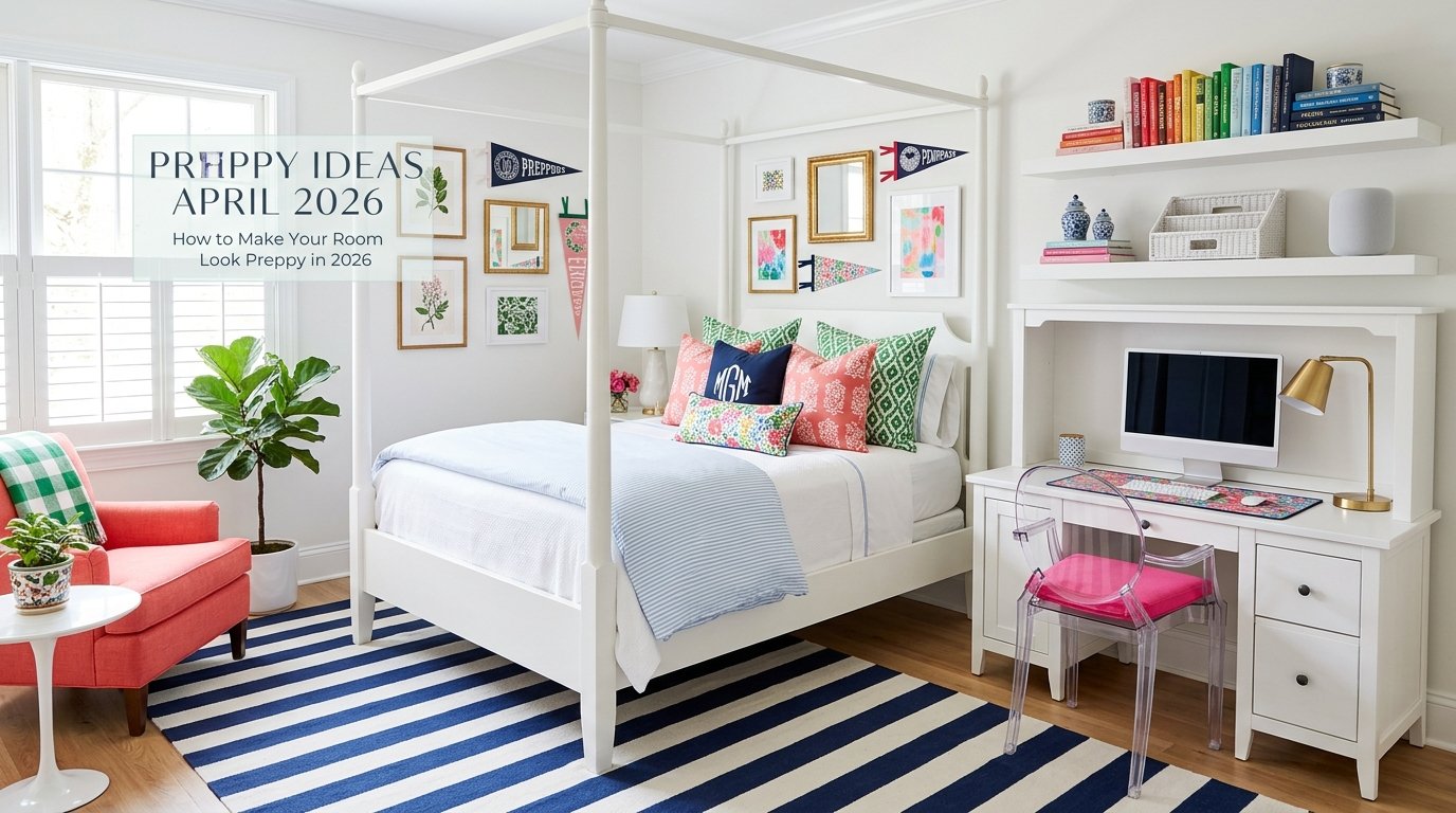
What “Preppy Room Decor” Actually Means in 2026
The word “preppy” traces back to the preparatory school culture of the American Northeast – think ivy-covered brick buildings, tailored blazers, and a certain ease with formality. That all-American design style, deeply rooted in East Coast tradition, has always carried a visual vocabulary: bold patterns, quality materials, personalized touches, and a confident mix of old and new.
Preppy room decor, at its core, is about elevated familiarity. It feels like a place where someone actually lives – but lives with intention. It’s not minimalism, and it’s not maximalism for its own sake. It sits in that productive middle ground: classic silhouettes paired with modern preppy style, vintage accents grounded by crisp white trim, polished surfaces softened by natural textures.
The 2026 iteration of this aesthetic has absorbed influences from grandmillennial style (the cozy, pattern-rich nostalgia trend), coastal preppy decor, and even the chinoiserie style that’s been reappearing in high-end interiors. Understanding what these elements share – a respect for craft, a love of pattern, and a commitment to timeless interior design – is the starting point for building any genuinely preppy room.
For a broader grounding in the style’s roots and how it translates across fashion and home, Preppyglow is a solid reference that connects the lifestyle dots clearly.
Building the Right Color Foundation: The Moody Prep Palette
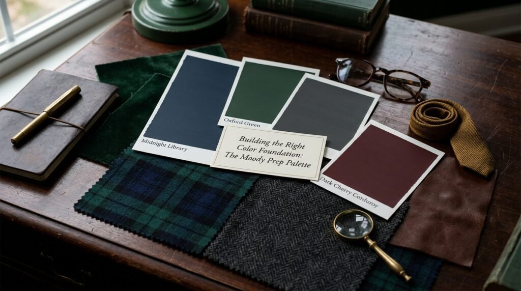
Most people start preppy decorating with navy blue accents and call it done. That’s the entry-level version. The rooms that genuinely feel elevated in 2026 are working with something richer – what designers are calling the “moody prep palette.”
Charcoal gray walls have replaced the pale blue and sage green of earlier cycles as the backdrop of choice for sophisticated home design. They read serious without being cold, and they make polished brass hardware and crisp white trim pop in a way that beige neutrals simply can’t match. Pair charcoal walls with blush pink upholstery and warm brass accents, and the result is unexpected – far less predictable than the standard navy-and-white scheme.
That said, olive green interiors are having a genuine moment right now. Olive reads as a natural, grounded tone that still carries the preppy aesthetic’s sense of tradition. It works particularly well in spaces layered with wool rugs and leather or rattan furniture.
Don’t dismiss true joy yellow accents either. A single mustard-yellow throw, a set of brass-framed botanical artwork, or even a painted accent chair in a warm ochre shade can animate an otherwise muted room without disrupting its sophistication. Color in preppy interiors works best when it surprises in small doses.
Quick Palette Reference:
| Mood | Primary | Secondary | Accent |
|---|---|---|---|
| Classic Prep | Navy blue | Crisp white | Polished brass |
| Moody Prep | Charcoal gray | Blush pink | True joy yellow |
| Natural Prep | Olive green | Beige neutrals | Rattan + brass |
| Coastal Prep | Soft sage green | White lacquer | Navy + coral |
Mastering the Holy Trinity of Patterns
Pattern is where preppy interior design truly distinguishes itself. The instinct for people new to the style is to pick one pattern and repeat it – a plaid sofa, plaid pillows, plaid curtains. That approach flattens everything. The rooms that work have learned a simple but important principle: pattern scale hierarchy.
Anchor the Floor with a Large-Scale Stripe
A large-scale stripe for your rug sets the visual foundation of the room. The scale matters – a rug with four-inch stripes in navy and cream reads as bold but not busy, and it provides a strong geometric anchor beneath softer elements. This is also where layered rug styling comes in: a smaller jute rug layered over a larger striped base adds tactile depth and grounds the whole arrangement.
Choose a Medium-Scale Plaid for Upholstery
Plaid patterns on a sofa, armchair, or window bench introduce warmth and a distinctly ivy league aesthetic. The key is choosing a plaid with at least three colors so it bridges your palette – a navy, cream, and olive plaid, for instance, ties together all three zones of the room without requiring extra effort. Medium scale means the pattern is visible but not overpowering from across the room.
Reserve Small-Scale Florals for Accents
Small-scale floral prints on accent pillows, lampshades, or a single upholstered headboard introduce femininity and softness without overwhelming the stronger patterns below. This is the classic + contemporary blend that makes modern preppy style feel current – florals that reference tradition without being fusty.
The stripes, plaid, florals mix sounds complicated until you see it in practice. The rule of thumb: large at the bottom, medium in the middle, small at the top. Follow that spatial logic and the layering almost always works.
Jute, Grasscloth, and the Texture Layer
Tactile surfaces are the unsung heroes of polished home decor. A room can have perfect color balance and ideal pattern hierarchy and still feel flat if every surface is the same material. Texture is what gives a space its depth when photographed – and its warmth when you’re actually sitting in it.
Jute rug layering is one of the most practical techniques in this aesthetic. A flat-weave jute under a softer wool rug adds natural contrast underfoot and is genuinely functional (jute is durable and inexpensive, making it a forgiving base layer). The visual effect is a collected, layered look that reads as more considered than a single rug ever can.
Grasscloth texture on walls – either as actual grasscloth wallpaper or a paint technique that mimics its weave – is experiencing a revival in preppy interiors. It introduces organic warmth that painted walls can’t replicate, and it pairs exceptionally well with polished brass hardware and white lacquer furniture. The contrast between the rough texture and the polished finish is what makes it interesting.
Wicker furniture and rattan furniture belong in this category too. Both materials bring a casual, natural quality that prevents preppy rooms from feeling stiff or overly formal. A rattan side chair, a wicker magazine basket, or even a wicker pendant lamp introduces just enough relaxed, coastal preppy decor energy to keep the space livable.
The Monogram: Personal Styling Without the Sentimentality Trap
Monogram decor is one of the most polarizing elements in preppy interior design. Done poorly, it reads as a college dorm leftover. Done well, it’s one of the most effective personalization tools available.
The difference is almost entirely in execution. A single oversized monogram pillow in a plain font looks amateur. A set of embroidered linen napkins with a small block-letter initial, a lacquered tray with your initials stenciled in gold, or a custom doormat – these feel like they belong to someone with taste. The monogram should be discoverable, not announced.
In 2026, personalized interior styling has expanded beyond the single letter to include family crests, custom bookplates on built-in shelving, and even bespoke needlepoint pillows. These elements connect back to the old-money tradition that underlies the ivy league aesthetic – the sense that a home has been accumulated and personalized over time, not assembled from a single shopping trip.
High-Gloss Lacquer, Brass Hardware, and the Polish Factor
One of the clearest markers of a genuinely polished home is the quality of its reflective surfaces. High-gloss lacquer furniture – a white lacquer dresser, a lacquered console, a glossy side table – catches light and creates visual movement in a room that matte surfaces simply cannot.
This doesn’t mean everything should gleam. Lacquered pieces work precisely because they contrast with matte grasscloth walls, natural jute, and soft linen upholstery. One or two lacquered pieces per room is usually the right calibration.
Polished brass hardware is similarly impactful in small doses. Replacing standard brushed nickel cabinet pulls with polished brass immediately upgrades the sophistication of any piece of furniture. The same applies to curtain rods, picture frame hooks, lamp bases, and light switches. These are low-cost, high-return interventions that make a room feel finished.
Chinoiserie, Ginger Jars, and the Art of the Curated Detail
Chinoiserie style has been a staple of American preppy interiors since the colonial era – it arrived through the same trade routes that brought blue-and-white porcelain to European drawing rooms, and it never really left. In 2026, it’s been updated: ginger jars styling is everywhere, with oversized blue-and-white ginger jars used as lamps, vases, or purely sculptural objects on bookshelves and consoles.
The appeal of chinoiserie decor in a preppy context is its combination of pattern, history, and a certain global reach that implies cultural literacy. A pair of ginger jars on a lacquered console says something different about the occupant than a pair of plain ceramic vases – it signals taste with a history behind it.
Botanical artwork in gilded frames works in a similar register. Framed prints of botanical illustrations – particularly antique-style ones – bring the same combination of natural reference and historical weight. They’re an easy gallery wall anchor and work well alongside more contemporary pieces.
Building a Gallery Wall That Actually Works
Gallery wall ideas are everywhere online, but most of them result in collections that look more like storage than curation. For a preppy home aesthetic, the gallery wall should feel like it’s been assembled by someone who travels, reads, and has genuine interests – not someone who printed nine things from the same website.
A few principles that actually work:
- Mix frame materials – gilt frames alongside simple black frames alongside natural wood adds variety without chaos
- Vary the content intentionally – botanical prints, a vintage map, a monogrammed crest, and one or two personal photographs create narrative
- Use a consistent mat color (usually crisp white) to unify disparate frame styles
- Include at least one oversized piece as an anchor, then build around it asymmetrically
- Leave breathing room – preppy gallery walls are curated, not wallpapered
The gallery wall in a preppy room is where the space develops its personality. It’s also where vintage-inspired decor and botanical artwork coexist most naturally.
Checkered Rugs, Tailored Window Treatments, and the Foundation Details
Checkered rugs have returned as a foundational element of modern preppy bedrooms and living rooms. The pattern is geometric, high-contrast, and inherently structured – which gives it a versatility that stripes sometimes lack. A black-and-cream checkered rug under a brass-legged coffee table is one of the most reliably elegant combinations in this aesthetic.
Tailored window treatments are equally foundational. The difference between preppy interiors that feel complete and those that feel unfinished is almost always the windows. Curtain trim styling – adding a contrasting border in a complementary color or pattern – is a detail borrowed from fashion that translates directly to home. A cream linen curtain with a navy grosgrain trim border, hung high and wide, instantly elevates a room’s perceived height and finish quality.
Skirted furniture – specifically skirted sofas, chairs, and even beds – brings a softness and historical reference that leggy furniture can’t replicate. The skirt grounds the piece, hides the structural mechanics, and references the tailored furniture design tradition that’s central to the grandmillennial style revival.
Rattan, Wicker, and Bringing Natural Materials Indoors
The natural material trend in preppy interiors isn’t about going rustic – it’s about contrast. Rattan furniture and wicker furniture introduce organic texture that makes polished brass, lacquered surfaces, and crisp linens feel more interesting by comparison.
A rattan headboard in a preppy bedroom grounds the space and brings warmth that upholstered alternatives sometimes lack. Wicker baskets used as storage blend function and form in a way that plastic or fabric bins never can. These materials carry the coastal preppy decor sensibility – a reminder that the original preppy aesthetic was always connected to outdoor life, sailing, and natural settings.
How to Apply These Preppy Room Ideas in a Small Space
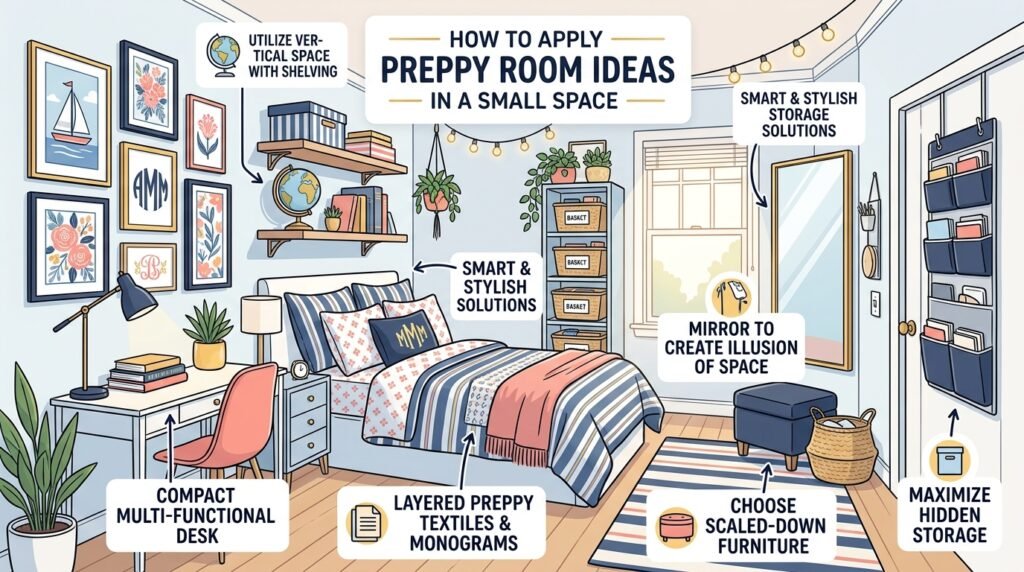
Small room styling requires a different set of priorities, but the preppy aesthetic actually adapts better to small spaces than most people expect. The key is space scaling techniques and a disciplined approach to what gets included.
What works in small preppy rooms:
- Scale-appropriate furniture – a skirted loveseat instead of a full sofa; a rattan accent chair instead of an upholstered armchair
- Vertical gallery walls – drawing the eye upward makes ceilings feel higher
- A single large-scale pattern – one bold stripe or plaid reads more sophisticated than several small competing patterns
- Mirrors with brass or gilt frames – they expand the perceived space while adding preppy polish
- Layered lighting – table lamps, a floor lamp, and overhead lighting create dimension that overhead-only schemes flatten
What to avoid:
- Multiple rugs that compete rather than layer
- Overly large furniture pieces that interrupt circulation
- Too many small accessories that create visual noise instead of curated depth
For anyone working with a small bedroom or studio apartment, the preppy room ideas for small spaces really come down to editing aggressively and spending the saved budget on one or two genuinely high-quality anchor pieces – a well-made brass lamp, a properly fitted curtain, a real wool rug.
Using Technology to Preview Your Space Before Committing
One genuinely practical development in interior styling is the AR room visualizer – augmented reality tools that let you preview furniture placement, rug sizing, and color choices in your actual room before buying anything. For a pattern-heavy aesthetic like preppy interior design, where getting the scale hierarchy wrong is easy, these tools are worth using.
Augmented reality interior design apps have improved dramatically in accuracy. They won’t replace the judgment call of an experienced decorator, but they do prevent the most common and expensive mistakes: a rug that’s too small, a sofa that blocks traffic flow, a gallery wall arrangement that doesn’t balance. Think of them as a final check before committing – particularly useful when you’re mixing several patterns and want to confirm that the scale relationships work in your specific space.
Preppy Room Decor vs. Similar Aesthetics: Key Differences
One of the most common questions in interior styling is how preppy room decor differs from aesthetics it’s often confused with.
| Aesthetic | Preppy | Grandmillennial | Coastal | Traditional |
|---|---|---|---|---|
| Pattern approach | Structured, layered | Maximalist, nostalgic | Light, airy | Formal, restrained |
| Color palette | Bold classics + moody darks | Warm pastels + chintz | White, blue, natural | Deep jewel tones |
| Key materials | Brass, lacquer, jute, wool | Velvet, chintz, lace | Linen, rattan, driftwood | Mahogany, silk, marble |
| Overall feel | Polished + livable | Cozy + nostalgic | Relaxed + bright | Formal + structured |
| Personality signal | Confident, active, classical | Sentimental, creative | Relaxed, casual | Reserved, established |
Preppy borrows from all of these but maintains a distinct energy – it’s more active and confident than traditional, more structured than coastal, and more polished than grandmillennial. The ivy league aesthetic underpinning keeps it grounded in a specific cultural history even when the individual elements vary widely.
You can explore the deeper cultural thread connecting all of these design sensibilities at Preppyglow, which covers the lifestyle context behind the visual choices.
Lesser-Known Preppy Styling Insights Worth Knowing
A few things that experienced preppy decorators know that most guides skip:
The books matter. A preppy bookshelf isn’t filled with decorative spines – it has real books, organized by subject, interspersed with small objects (a ginger jar, a framed photo, a brass bookend). The reading life implied by a real library is part of the aesthetic.
Sporty references belong. Oars over a fireplace, a vintage tennis racquet, a framed rowing team photograph – these aren’t kitsch in a preppy room; they’re authentic. The all-American design style has always been athletically inflected.
The quality of the textiles is non-negotiable. You can fake pattern hierarchy, but you can’t fake the feel of a real wool rug or quality linen curtains. Investing in a few genuinely good textile pieces and supplementing with less expensive accessories almost always produces better results than the reverse.
Monochromatic preppy rooms are underutilized. An all-navy room with varying textures – wool, lacquer, brass, linen – is extraordinarily effective and far less common than the multi-color schemes most preppy rooms attempt.
Frequently Asked Questions About Preppy Room Ideas
What colors are most associated with preppy room decor?
Classic preppy room decor centers on navy blue, crisp white, and forest green – the ivy league aesthetic’s core palette. In 2026, the moody prep palette has expanded this to include charcoal gray, olive green, blush pink, and true joy yellow accents. The key is using bold colors with confidence while balancing them with neutral tones like beige and sage green.
How do I mix patterns in a preppy room without it looking chaotic?
Use pattern scale hierarchy: large-scale patterns on the floor (stripes, checks), medium-scale on upholstery (plaid), and small-scale on accents (florals, geometric prints). Keep the color palette consistent across patterns – two or three colors appearing across all patterns create visual unity even when the patterns themselves are very different.
What’s the difference between preppy style and grandmillennial style?
Both aesthetics value pattern, history, and traditional references, but grandmillennial style leans warmer, nosier, and more overtly sentimental – think chintz, lace, and a lived-in abundance. Preppy interior design is more structured, more athletic in its references, and more comfortable with bold, high-contrast choices. Both can incorporate chinoiserie decor and vintage accents, but the preppy version tends to feel more edited and intentional.
Can preppy room ideas work in a rental apartment?
Absolutely. The most impactful preppy room transformations – layered rug styling, gallery walls, curtain trim styling, and swapping out hardware – are all reversible. Even in a space you can’t paint, a dark-colored area rug, high-hung curtains in a pattern, and polished brass hardware on furniture (not the walls) will shift the room’s character significantly.
What are the most important furniture pieces for a preppy bedroom?
Prioritize a quality upholstered or rattan headboard, properly scaled bedside tables with brass hardware, a tailored window treatment, and at least one patterned textile (a plaid throw, a striped rug, or a floral duvet). A monogram detail and a small gallery wall above a dresser complete the look. Avoid matching furniture sets – collected, individual pieces always read as more authentically preppy than a coordinated bedroom suite.
How do I make a small room look preppy without it feeling cluttered?
Focus on vertical space – a tall gallery wall, floor-to-ceiling curtains, and tall lamps all draw the eye upward. Choose one dominant pattern rather than several competing ones, use a single layered rug pairing instead of multiple separate rugs, and keep accessories to a curated minimum. Quality over quantity is the operating principle: three genuinely good objects are always more effective than ten average ones.