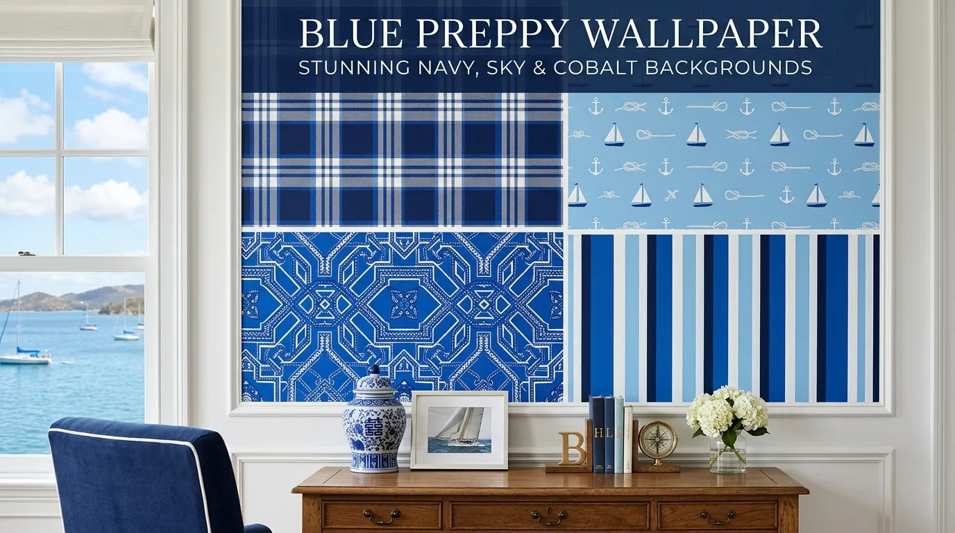
Blue Preppy Wallpaper: Stunning Navy, Sky & Cobalt Backgrounds
There’s something almost architectural about navy blue. It doesn’t just sit on a screen it commands it. Whether you’re styling a phone lock screen, pulling together a mood board, or refreshing a desktop workspace, blue preppy wallpaper occupies a unique design territory: classic enough to feel intentional, deep enough to feel sophisticated, and versatile enough to work across every aesthetic context imaginable.
This guide covers everything from the roots of navy as a preppy design staple to the technical differences between HD and 4K resolution backgrounds with practical advice woven throughout for anyone serious about getting their digital aesthetic right.
What Is Blue Preppy Wallpaper, and Why Does It Matter?
At its core, a blue preppy wallpaper is a digital background image that draws from the visual language of the preppy style tradition structured color palettes, clean lines, nautical references, and an overall sense of effortless elegance. Navy blue sits at the center of this aesthetic because of its long association with East Coast American fashion culture: think sailing clubs, collegiate blazers, and the kind of restrained confidence that doesn’t need to shout.
The term “preppy” itself emerged from the preparatory school culture of New England in the mid-20th century, and navy blue was essentially its unofficial uniform color. When that sensibility migrated into digital design and phone customization culture which happened rapidly through Instagram, Pinterest, and aesthetic-focused communities in the 2010s navy blue wallpapers became a go-to for anyone wanting a background that communicated taste without clutter.
But blue preppy wallpaper isn’t just navy. The family includes sky blue gradients, cobalt accents, royal blue backgrounds, and deep midnight blue aesthetics. Each shade carries slightly different emotional weight and visual function. Understanding which variation fits your use case is half the battle.
For a deeper dive into the broader style system this color inhabits, Preppyglow offers an excellent reference on what preppy actually means in contemporary visual culture.
A Brief History of Navy Blue as a Design Color
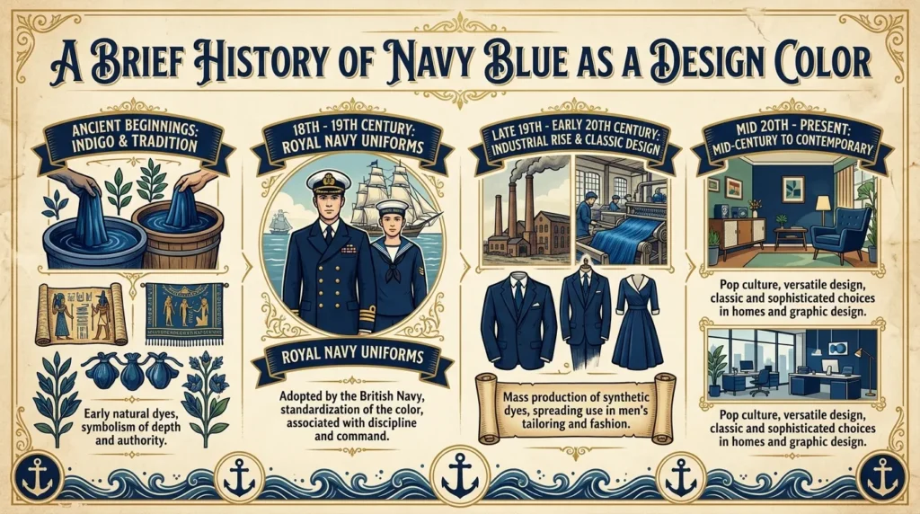
Navy blue as a named color has a surprisingly precise origin. The British Royal Navy standardized the dark blue uniform dye in 1748, giving the color its name. From that point forward, navy carried connotations of discipline, authority, and precision qualities that translated naturally into design contexts centuries later.
By the 20th century, navy blue had embedded itself into American preppy culture through institutions like Yale, Princeton, and the Ivy League boarding schools that fed them. Designers like Ralph Lauren codified the navy-and-white visual grammar into a commercially successful aesthetic language in the 1970s, and from there it entered mainstream consciousness as the color of confident, understated luxury.
In digital design terms, navy blue backgrounds gained traction as minimalist aesthetics became dominant in the early 2010s. Platforms like Unsplash helped democratize access to high-quality dark blue background images, making the navy blue aesthetic available to anyone with a phone. What was once a color reserved for tailored blazers became a mood board staple.
Popular Styles of Navy Blue Aesthetic Wallpapers
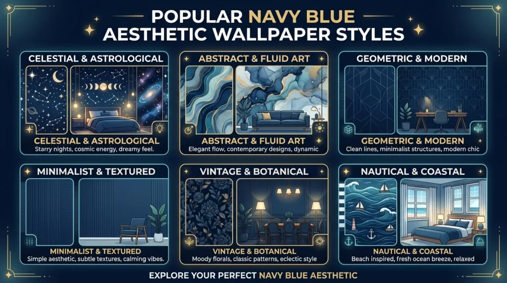
Dark Navy Blue Gradient Backgrounds
Gradient wallpapers remain one of the most universally appealing background formats because they provide visual depth without complexity. A dark navy blue gradient transitioning from near-black indigo blue shades at the edges into a richer cobalt or royal blue at the center gives any screen a moody, cinematic quality that flat solid colors simply can’t achieve.
For phone screens especially, the gradient interacts naturally with app icon grids, creating a cohesive visual field rather than a flat backdrop. The navy blue gradient wallpaper HD format works particularly well on OLED screens, where true blacks and deep blues are rendered with exceptional contrast.
Minimalist Navy Blue Wallpapers for Desktop and Phone
There’s a reason the minimalist navy blue wallpaper has become one of the most-searched background categories. Minimalism and navy blue are philosophically aligned both favor restraint, clarity, and intentionality over decoration for its own sake.
A navy blue minimalist wallpaper might be nothing more than a clean solid color background with a subtle texture or a single geometric line. On a desktop computer, this kind of background recedes and lets the workspace icons and windows become the visual focus. On a laptop or iPhone, it reads as deliberate and curated rather than default.
The key to a truly good minimalist navy design is texture. A flat navy blue solid color background can feel sterile; a navy blue background with slight linen, matte, or paper grain texture feels organic and considered.
Abstract Navy Blue Texture Designs
Abstract navy blue backgrounds occupy a different creative space. These wallpapers might incorporate fluid paint textures, digital brushwork, marble-effect layers, or algorithmic patterns all rendered in deep blue, midnight blue aesthetic tones, or mixed with indigo and cobalt.
The navy blue texture category is particularly useful for creative professionals. A dark blue nature photography-inspired texture, for example, works as a compelling background for design presentations or portfolio covers. Abstract navy blue background ideas frequently surface in professional design communities because they balance visual interest with neutrality they enhance rather than compete.
Navy Blue Ocean and Sky Photography
Natural photography represents a distinct category within the blue preppy wallpaper world. Images of a navy blue sky just before dawn, a dark ocean surface at dusk, or a wide-angle coastal shot capture something no graphic design can entirely replicate: the genuine weight and movement of blue in the natural world.
Dark blue nature photography wallpapers tend to feel more emotionally resonant than their graphic-design counterparts. A photograph of navy blue ocean waves has atmosphere built in the viewer brings their own associations with water, depth, and openness. Dark aesthetic wallpaper collections frequently lead with these kinds of images precisely because they communicate mood immediately.
Navy blue lighting in photography achieved through blue-gelled studio lights or natural twilight conditions creates a moody blue background with genuine tonal complexity. These images often contain subtle variations across the blue spectrum that keep the wallpaper visually interesting even after extended viewing.
Navy Blue Pattern and Fabric Texture Backgrounds
The pattern and fabric texture category connects most directly to the original preppy visual tradition. Navy blue pattern designs including herringbone, windowpane plaid, rope knots, anchors, or argyle draw directly from the textile vocabulary of prep school and nautical culture.
These backgrounds work particularly well for users who want something that reads as explicitly preppy rather than simply minimalist or aesthetic. A navy blue wallpaper for phone with a subtle rope or anchor pattern references the maritime heritage of the preppy style system in a way that feels historically grounded rather than trendy.
HD vs. 4K Navy Blue Image Quality: What Actually Matters
This is a question worth answering precisely, because the technical landscape here is often oversimplified.
| Format | Resolution | Best Use Case | File Size | Visual Difference |
|---|---|---|---|---|
| HD (1080p) | 1920 × 1080 px | Standard desktop, older laptops | Small–Medium | Clear and sharp on most screens |
| 2K / QHD | 2560 × 1440 px | High-DPI laptop screens | Medium | Noticeable improvement on sharp displays |
| 4K UHD | 3840 × 2160 px | 4K monitors, modern desktop computers | Large | Maximum detail, essential for large screens |
| iPhone Retina | Varies by model | iPhone wallpaper optimization | Medium | Must match device native resolution |
| Mobile Optimized | 1080 × 1920 px | Android and iPhone lock screens | Small–Medium | Portrait-format essential for phones |
The honest answer on HD vs 4K: for phone wallpapers, the difference is rarely perceivable because phone screens even flagship iPhones and Android devices have physical dimensions that cap the visible detail. A navy blue HD wallpaper and a navy blue 4K background will look virtually identical on a 6-inch phone screen.
Where 4K genuinely matters is on large desktop monitors or modern MacBook Pros with high-DPI displays. On a 27-inch 4K monitor, a low-resolution navy blue desktop background will show visible pixelation, especially in gradient transitions. For those setups, always source the highest resolution available.
For free navy blue background images HD quality, platforms like Unsplash provide consistently high-resolution files, often reaching 4K or beyond, available without cost for personal and commercial use.
Navy Blue for Phone vs. Desktop: Choosing the Right Orientation
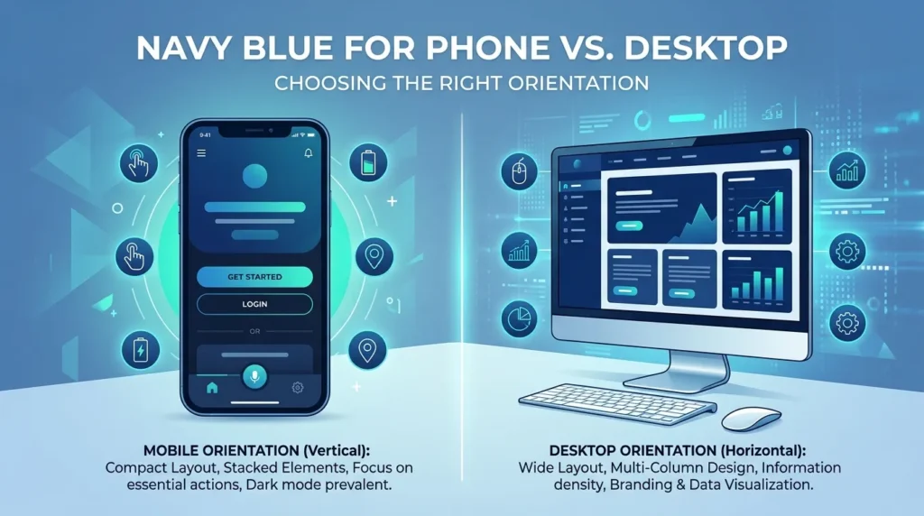
One practical consideration that often gets ignored: orientation. A navy blue wallpaper for phone needs to be portrait-format (taller than it is wide) to avoid cropping issues on the lock or home screen. A navy blue desktop background needs to match your monitor’s aspect ratio typically 16:9 for standard displays or 16:10 for certain laptops.
The mistake many people make is downloading a beautiful landscape image and applying it to a phone wallpaper without any adjustment. The result is a heavily cropped, off-center image that loses whatever made the original compelling.
When sourcing a navy blue iPhone wallpaper specifically, look for images that are at least 1170 × 2532 pixels for current iPhone models that’s the native resolution of the iPhone 14 Pro and similar. Portrait-oriented photographs of navy blue sky or dark blue ocean work particularly well because they maintain their compositional integrity when displayed vertically.
For laptop and desktop computer use, navy blue aesthetic wallpapers at 2560 × 1440 or 3840 × 2160 pixels are the safe choices for future-proofing across display upgrades.
The Mood Behind the Color: Why Deep Blue Resonates
Color psychology isn’t pseudoscience when applied to practical design decisions. Navy blue consistently registers as trustworthy, calm, and sophisticated in cross-cultural visual perception research. Unlike the bright, attention-demanding energy of red or yellow, deep blue color creates a sense of contained focus which is precisely why it pairs so well with a productive workspace or a calm phone aesthetic.
Midnight blue aesthetic spaces whether physical rooms or digital environments tend to reduce visual noise. When your desktop or phone background is a well-chosen dark blue background, the eye isn’t fighting for stimulation. The icons, widgets, or applications become the active layer, while the background does the quiet work of setting tone.
This is also why the elegant blue theme has migrated into luxury branding contexts. Deep, saturated navy communicates premium quality without the coldness of pure black or the clinical edge of white. The luxury navy blue design language, whether on a packaging material or a phone screen, signals considered taste.
Royal blue backgrounds split the difference between deep navy and brighter cobalt in interesting ways. Where navy reads as established and serious, royal blue has more energy and vibrancy it’s more closely associated with celebration and confidence. Choosing between them is often a question of whether you want your screen to feel like a library or a gallery.
Lesser-Known Insights About the Navy Blue Aesthetic
Here’s something most style guides won’t tell you: the navy blue aesthetic reads differently depending on what surrounds it. On a phone with pastel app icons, navy becomes a dark anchor that makes everything pop with contrast. On a phone with dark-mode apps and minimal widgets, navy blends into a seamless, immersive experience.
This adaptability is one reason navy blue pattern design works across such a wide range of contexts from student laptops to executive desktops. It’s a background that doesn’t impose a single mood; it takes on the mood of what’s placed over it.
Another underappreciated detail: the difference between navy blue and indigo is more meaningful than most people realize. Indigo sits at the boundary between blue and violet on the color spectrum and carries a slightly more mysterious, introspective quality. Navy blue is definitively in the blue family, grounded and directional. When a wallpaper described as “navy blue” starts pulling toward purple, it’s likely incorporating indigo blue shades rather than pure navy which isn’t a problem, but it’s worth recognizing if color accuracy matters for your use case.
Where and How to Use Navy Blue Aesthetic Backgrounds
Practical Applications by Context
Phone Lock and Home Screens: The blue night background style dark navy fading into near-black works exceptionally well for OLED phone screens because it creates true blacks at the edges, saving battery and enhancing perceived contrast.
Desktop Workspaces: A navy blue minimalist wallpaper for desktop creates a professional, distraction-free working environment. Pair it with a minimal icon set and a clean dock for maximum coherence.
Design Projects and Presentations: Navy blue pattern background for projects instantly elevates amateur-looking work. A consistent navy background across a slide deck signals visual sophistication.
Creative Mood Boards: Dark blue aesthetic photography ideas translate well to physical and digital mood boards. Combining ocean, sky, and abstract texture images creates a rich, cohesive visual narrative.
Social Media Aesthetic: Users building a consistent Instagram or Pinterest aesthetic around navy and white benefit from a structured navy blue theme wallpaper collection sourced in advance, sized appropriately, and organized for easy access.
For users building out a complete preppy-inspired aesthetic across both digital and lifestyle contexts, the style resources at Preppyglow offer a useful framework for understanding how navy fits into the broader preppy visual system.
Navy Blue vs. Related Colors: Understanding the Differences
The blue spectrum is crowded, and confusion between adjacent colors is common. Here’s a practical breakdown:
Navy Blue vs. Midnight Blue: Midnight blue is darker almost black with blue undertone. Navy is definitively blue but deep. On a phone screen, midnight can read as near-black while navy reads as clearly blue.
Navy Blue vs. Royal Blue: Royal blue is brighter and more saturated. Navy is darker and more muted. Royal blue background designs feel more energetic; navy feels more grounded.
Navy Blue vs. Cobalt: Cobalt is a pure, vivid medium blue significantly brighter than navy. It’s the blue of a clear sky at 2pm versus navy’s pre-dawn blue.
Navy Blue vs. Indigo: Indigo has a violet component. Under certain lighting or screen calibrations, indigo blue shades can appear almost purple. Navy is reliably, neutrally blue.
Navy Blue vs. Dark Blue (General): “Dark blue” is a descriptor rather than a specific color. Navy is one specific version of dark blue, but dark blue backgrounds can include midnight, indigo, or even dark teal. Navy specifically refers to the traditional British naval blue.
Frequently Asked Questions About Blue Preppy Wallpaper
What makes a wallpaper “preppy” versus just being navy blue?
The preppy quality comes from context and association rather than the color alone. A navy blue wallpaper becomes preppy when it incorporates design elements from the preppy visual tradition nautical motifs, classic patterns like herringbone or stripes, clean geometric structure, or a color palette that pairs navy with white, gold, or hunter green. A flat navy solid can look preppy or minimal depending on the eye of the viewer, but pattern-based navy designs more clearly signal the aesthetic.
What resolution should I use for a navy blue wallpaper on an iPhone?
For current iPhone models, a minimum resolution of 1170 × 2532 pixels is recommended for home and lock screen use. For the best results with navy blue iPhone wallpaper, look for portrait-oriented images at this resolution or higher. Images sourced at 4K can be scaled down without quality loss.
Where can I find free high-resolution navy blue background images?
Platforms like Unsplash offer a large library of free stock navy blue images available for download without registration. Search terms like “dark blue background,” “navy blue texture,” or “navy blue ocean” typically return high-quality results suitable for both personal and commercial use. Always verify the license before using images commercially.
Is there a difference in how navy blue looks on OLED vs. LCD screens?
Yes, significantly. OLED screens render deep blues with true black-adjacent shadows and exceptional saturation, making dark navy blue gradient backgrounds look cinematic and immersive. LCD screens have backlighting that can make very dark blues look slightly washed out or greenish depending on the panel quality. If you’re choosing a navy blue 4K wallpaper for laptop or desktop, preview it on your specific display before committing.
Can navy blue wallpapers work in both light and dark phone themes?
Navy blue works in both contexts but behaves differently. In a dark phone theme, navy blends naturally into the overall dark aesthetic and reads as cohesive. In a light theme, navy creates strong contrast that can feel dramatic or bold. The most versatile approach is to use a navy blue gradient background that transitions to a slightly lighter blue at the top of the image this gives visual breathing room in light-theme environments while maintaining depth in dark-theme setups.
What’s the best navy blue wallpaper style for a productive work-from-home setup?
For a desktop computer used for focused work, a navy blue minimalist wallpaper with subtle linen or matte texture is the most effective choice. It provides enough visual interest to feel personalized but generates no distracting visual noise. Avoid highly detailed abstract navy blue texture designs or photography wallpapers with complex compositions during focused work sessions the eye tends to wander toward image detail during mentally demanding tasks.
How do I choose between a navy blue pattern design and a solid color background?
Pattern designs are appropriate when you want the wallpaper itself to contribute to an aesthetic statement preppy, nautical, or textile-inspired looks benefit from pattern. Solid or gradient navy blue backgrounds are better choices when you want the wallpaper to recede and support overlaid content (app icons, widgets, desktop files). As a practical rule: if you use many apps or desktop items, go solid or gradient; if your screen is relatively clean and minimal, a pattern can add character without chaos.