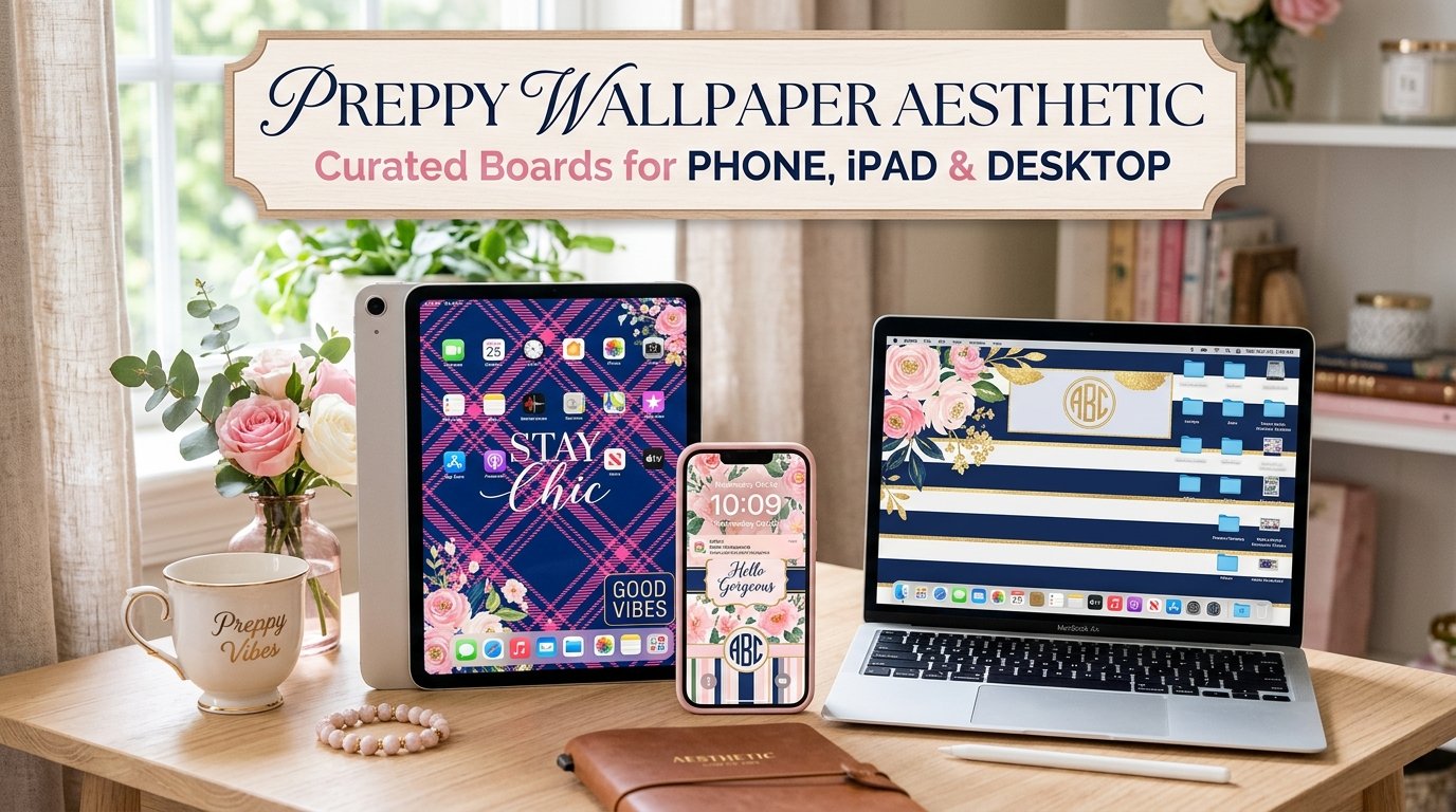
Preppy Wallpaper Aesthetic: Curated Boards for Phone, iPad & Desktop 2026
There’s something quietly magnetic about a well-curated home screen. The moment your lock screen reflects exactly who you are clean lines, a soft pastel palette, maybe a stripe or two your device stops feeling like a tool and starts feeling like an extension of your personal style. That’s the pull of the preppy wallpaper aesthetic, and it’s not slowing down anytime soon.
Whether you’re setting up a new iPad Pro, refreshing your phone’s lock screen, or building a Pinterest board that feels genuinely cohesive, understanding this aesthetic from the ground up helps you make better choices not just prettier ones.
What the Preppy Aesthetic Actually Means (And Where It Came From)
Before you can curate a wallpaper board that feels right, it helps to know why this aesthetic resonates so deeply. The preppy look didn’t begin on Pinterest. It has roots stretching back to the elite boarding schools and Ivy League campuses of mid-20th century America Yale, Harvard, Princeton where a particular dress code quietly became a cultural identity.
Polo shirts, loafers, chino trousers, navy blazers with gold buttons. That’s the sartorial origin. But preppy style was never just about clothing. It was about a certain composed, unhurried elegance the visual language of people who had taste, restraint, and a preference for things that endure. You can explore the full depth of this aesthetic and its evolution at Preppyglow, a resource dedicated entirely to the preppy lifestyle.
Over the decades, that classic American fashion vibe translated into interior design, stationery, and eventually, digital spaces. When the aesthetic customization wave hit iOS and Android accelerated by pandemic-era social media creativity the preppy look found a natural home on screens. The Ivy League aesthetic translated effortlessly: structured patterns, restrained color palettes, and a polished finish that looked intentional rather than effortful.
Today, what you see labeled as “preppy wallpaper” online sits at the intersection of that heritage and modern minimalism. It’s the digital equivalent of a well-pressed Oxford shirt familiar, structured, and always appropriate.
Defining the Preppy Wallpaper Aesthetic for Digital Screens
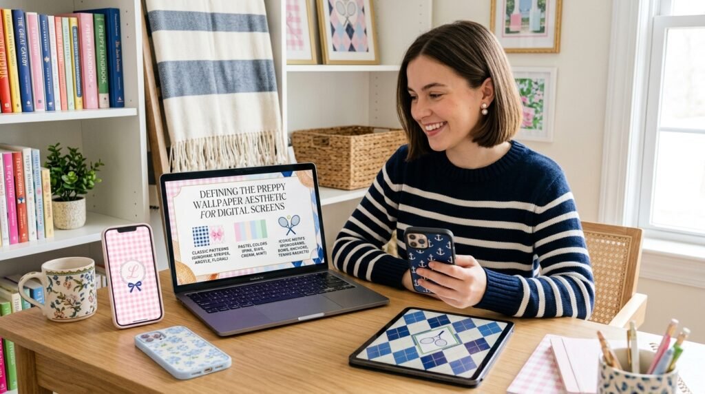
So what exactly makes a wallpaper “preppy”? The answer is more specific than “cute” or “aesthetic” in the general sense. A genuinely preppy iPad aesthetic background shares a few consistent traits:
- Structured patterns over organic chaos — stripes, gingham, argyle, and checks take priority over abstract watercolor splashes
- A curated, limited color palette — not maximalist rainbow energy, but two or three anchoring tones that feel considered
- Polished finish — high-resolution output, clean edges, no blurry or pixelated textures
- Subtle elegance — the design earns attention quietly, not loudly
The distinction matters because a lot of content tagged “aesthetic wallpaper” online is broad enough to include anything from cottagecore to dark academia. Preppy is its own lane classy wallpaper styles with a specific heritage and a very particular feeling. Think less dreamy, more decisive.
What separates preppy from adjacent aesthetics like clean girl or old money? Old money leans darker burgundy, hunter green, gold. Clean girl is ultra-minimal, almost clinical. Preppy sits in the middle: structured but warm, polished but approachable, classic but not stiff. It’s the chic and polished look with a hint of summer camp.
Popular Preppy Wallpaper Styles Worth Knowing
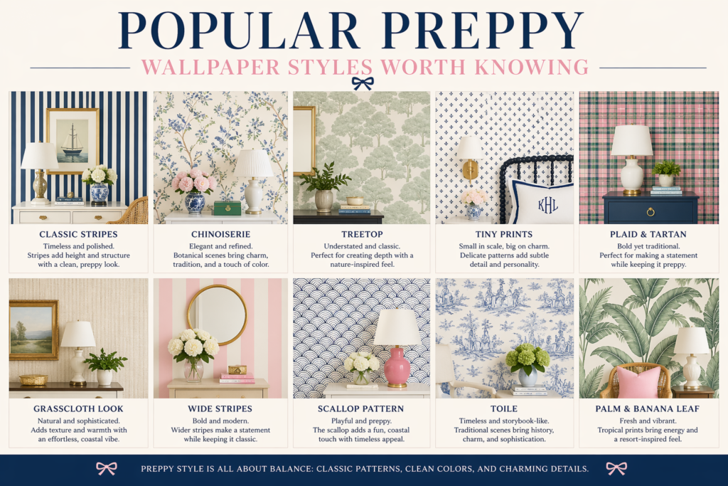
Not all preppy wallpapers are created equal. The category actually contains several distinct sub-styles, each with its own visual logic.
Minimal Preppy Designs
The minimal preppy aesthetic strips the formula down to its bones. A single stripe on a white ground. A subtle monogram centered on beige. A clean geometric border with nothing else competing for attention. This style performs exceptionally well on a Retina Display the simplicity lets the resolution do the talking, and every pixel counts.
If your aesthetic goal is a device that looks like it belongs in an architectural digest shoot, minimal preppy is where to start. It pairs naturally with icon packs that use thin, outlined symbols, creating a screen that feels more editorial than personal which is, for many people, exactly the point.
Floral Preppy Backgrounds
Floral in the preppy world is different from, say, cottagecore botanicals. Here, flowers are structured and deliberate think tightly arranged blooms in pastel pink or soft green tones, contained within a grid or border, rather than sprawling across the image with wild energy.
Floral patterns work especially well as lock screen wallpapers where you want something visually layered but not distracting. The iPad Air’s larger canvas lets detailed floral compositions breathe properly, which is part of why this device in particular has become so closely associated with the preppy iPad wallpaper category.
Pattern-Based Wallpapers: Stripes, Checks, and Beyond
This is the most classically preppy category of all. Stripes patterns navy and white, Kelly green and cream, pink and red are the direct descendants of Oxford-cloth button-downs and ribbon hatbands. Checkered design including gingham and windowpane checks carry the same lineage.
What makes these work as wallpapers is that they tile seamlessly, create visual rhythm without demanding attention, and provide the perfect neutral backdrop for widget stacks and app icons. They’re also among the most high-resolution iPad wallpaper-friendly options, since geometric precision benefits from every pixel Retina technology offers.
Argyle the diamond-pattern associated with golf sweaters and heritage knitwear sits in this category too. It’s perhaps the most aggressively preppy of all patterns, and it works surprisingly well in a pastel color palette for spring and summer setups.
Quote-Based Aesthetic Wallpapers
A slightly more personal strand of the preppy aesthetic involves typography quotes set in classic serif or script fonts against clean backgrounds. The quotes themselves tend toward the aspirational: references to hard work, classic literature, or self-possession. Think less “good vibes only” and more Fitzgerald or Hemingway.
Monogram style wallpapers also belong here your initials rendered in a block serif font, centered on a chambray blue or cream background. They’re deeply personal and visually quiet, which is the whole point.
The Best Color Themes for Preppy iPad Wallpapers
Color does more work in this aesthetic than almost any other element. The preppy palette is precise and knowing which combinations are truly preppy versus just pastel helps you make smarter choices.
Pastel Pink and Baby Blue
The most recognizable combination in the pastel aesthetic space. Together, these two colors carry summer associations sailing, lemonade, striped umbrella that anchor the preppy vibe. Pastel pink wallpaper tends to feel feminine and warm; baby blue aesthetic reads as calm and slightly preppy-sporty. Used together, they create a gentle contrast that works beautifully on an iPad home screen setup.
Neutral Beige and White
This is the quietly adult version of the preppy palette. Neutral beige background tones paired with crisp white feel more architectural than playful, which gives a home screen an almost editorial quality. Clean aesthetic wallpaper in this range is especially popular among users who want their device to feel intentional without being loud about it.
The beige-white combination also has a practical advantage: it’s easier to read text on particularly time, date, and notification previews on your lock screen.
Bright Summer Colors
Not all preppy is quiet. There’s a louder, more celebratory strand that draws from summer athletic wear light yellow aesthetic, coral, kelly green, and turquoise. These soft color backgrounds carry energy without chaos, because they’re still structured (solid grounds with minimal pattern, or contained in stripes) even when vivid.
This color territory is most popular in the spring-to-summer window, and it refreshes a device’s aesthetic the same way swapping your wardrobe does. Trendy wallpaper designs in this category appear in waves every year around April and May.
Soft Green Tones
Soft green tones sage, mint, moss have had a significant run in modern aesthetic design across interior decor and digital spaces alike. In the preppy context, soft green reads as refined and slightly old fashioned in the best way: it recalls cricket greens, ivy-covered brick, and English country gardens. As an iPad background, sage green creates a calming, grounded visual atmosphere that pairs well with white widget cards and sans-serif typography.
Free vs. Premium Preppy Wallpapers: Is There a Real Difference?
This question comes up constantly, and the honest answer is: it depends on where you’re looking.
| Feature | Free Wallpapers | Premium Wallpapers |
|---|---|---|
| Resolution | Variable (sometimes low) | Consistently high (iPad Retina-ready) |
| Originality | Often shared widely, repeated | Designed exclusively or in small sets |
| Format options | Usually JPG | Often includes PNG, PDF, and sized variants |
| Device-specific sizing | Rarely | Frequently (iPad Pro, iPhone, desktop) |
| Commercial use | Not always permitted | Usually clearly licensed |
| Platform | Pinterest, Reddit, free apps | Canva Pro, design shops, Etsy |
| Update frequency | Community-driven, irregular | Curated, seasonal drops |
Free options on Pinterest and Instagram can be excellent the community that creates and shares cute preppy wallpaper content is genuinely generous. But the trade-off is often resolution and sizing. A wallpaper that looks sharp on a phone may appear slightly soft on an iPad Pro‘s larger Retina display.
Canva is the middle ground that most people land on: the free tier offers more design control than a random download, and the pro features unlock the precision sizing options that make a high-resolution iPad wallpaper look genuinely professional.
Wallpaper apps dedicated to aesthetic customization have also grown significantly. The better ones allow you to filter by color palette and style, which makes finding a trendy aesthetic background that’s actually preppy (rather than generically soft) much faster.
How to Actually Download Preppy Wallpapers for Your iPad
The process is simple, but a few details make the difference between a wallpaper that looks perfect and one that just looks okay.
Step 1: Size first. Before downloading anything, confirm the resolution matches your device. The iPad Air uses a different pixel dimension than the iPad Pro. Searching for iPad HD wallpaper in the exact resolution for your model (easily found in your device settings under Display) saves significant frustration.
Step 2: Source matters. Pinterest is the largest repository of aesthetic iPad backgrounds by sheer volume, but the resolution is sometimes compressed during upload. Saving images directly from the original creator’s post often linked in the pin’s source URL typically yields a better file.
Step 3: Use Apple’s built-in perspective zoom thoughtfully. When you set a wallpaper on iOS, the system automatically enables perspective zoom (a parallax effect). For a preppy aesthetic background with precise geometric patterns, this can subtly distort the alignment. Toggle it off for pattern-based wallpapers specifically.
Step 4: Preview before committing. With iOS, you can see a full-screen preview before saving a wallpaper. Use it. What looks cohesive as a thumbnail sometimes breaks apart at full scale.
Tips to Customize Your iPad for a Complete Aesthetic Look
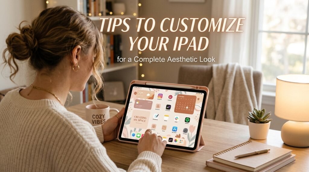
Wallpaper alone doesn’t create an aesthetic it creates a backdrop. The complete iPad aesthetic is a system, and these elements need to work together.
Matching Icons and Widgets
Your app icons should speak the same visual language as your wallpaper. For preppy aesthetics, icon packs in line art with thin strokes work well against pastel or neutral grounds. Solid candy-colored icons look jarring against a subtle chambray stripe.
Widgets weather, calendar, clock should use light-mode styling with minimal backgrounds, ideally white or transparent, so they don’t compete with the wallpaper. The home screen aesthetic should feel like a composed layout, not a collection of competing elements.
Lock Screen vs. Home Screen Setup
These two screens benefit from being related but not identical. A common approach: use a more detailed or pattern-heavy image (like a gingham stripe or floral grid) on the lock screen, and a simpler, cleaner version of the same color palette on the home screen. This creates visual depth across the device experience.
The lock screen on modern iOS also supports layered wallpapers, where foreground elements (like clock text) sit in front of the image. This works particularly well with soft color wallpapers that have a clear central area for the time display.
Organizing Apps for an Aesthetic Look
The final layer is app organization. A single page of apps organized by color or function, with folders kept to a minimum makes a home screen look intentional. Many aesthetic enthusiasts use a second page with an even simpler layout: only widgets, no app icons at all, showing the wallpaper as cleanly as possible.
For a deep dive into preppy style principles that translate directly into how you organize and curate your digital spaces, Preppyglow covers the lifestyle dimension thoroughly.
Organizing by color family is the most visually cohesive method for a preppy setup. Blues and greens on one side, pinks and neutrals on the other it sounds obsessive until you see it in action, and then it makes immediate sense.
Lesser-Known Insights About the Preppy Wallpaper Trend
A few things that rarely get mentioned in typical roundup posts:
The preppy aesthetic has stronger seasonal logic than most. Unlike dark academia (perennially autumn) or cottagecore (forever soft-spring), preppy tracks the actual Ivy League academic calendar and the American coastal summer. Wallpapers rotate blue-and-white stripes in June, richer plaid tones by October. Treating your device wallpaper as a seasonal object rather than a permanent fixture is very much in keeping with the aesthetic’s spirit.
Pattern scale matters more than people realize. A tiny gingham check looks very different on a 12.9-inch iPad Pro screen than on a phone. Patterns that feel charming at small scale can feel overwhelming at full tablet size. Always preview on the actual device.
Monochromatic preppy is an underexplored direction. Most preppy wallpaper content leans into multi-color palettes, but a single-color approach all-white with a tonal stripe, or sage-on-sage with a subtle grid can produce a more sophisticated and genuinely classy wallpaper style than the expected pastel combination.
The aesthetic translates differently across devices. The same wallpaper can feel very different on an iPad Air vs. a desktop monitor vs. a phone. A stylish tablet background with fine stripe detail may render beautifully on Retina but show aliasing artifacts on a lower-resolution desktop display. Always check the output across all your devices if you’re standardizing a look.
Frequently Asked Questions About Preppy Wallpaper Aesthetic
What makes a wallpaper count as “preppy aesthetic”?
A preppy aesthetic wallpaper typically combines a structured visual pattern (stripes, checks, monograms, or contained florals) with a curated color palette rooted in pastel or nautical tones. The finish should feel polished and deliberate. It’s distinguished from general “cute” wallpapers by its tie to the Ivy League aesthetic tradition an emphasis on classic American fashion vibe translated into visual design.
What are the best color combinations for a preppy iPad wallpaper?
The most effective combinations work within two or three tones maximum. Pastel pink and baby blue is the most iconic. Neutral beige and white reads as sophisticated. Navy and white feels nautical-preppy. Soft green paired with cream is popular for fall setups. Avoid mixing more than three palette colors — it quickly loses the composed quality that defines the aesthetic.
Where can I find high-quality preppy wallpapers for my iPad?
Pinterest has the largest volume of free preppy aesthetic backgrounds, though resolution varies. Canva (free and pro tiers) lets you create custom high quality wallpapers sized to your exact device. Dedicated wallpaper apps with aesthetic filters are a practical middle ground. For original or exclusive designs, Etsy and independent design shops often offer digital downloads optimized for specific iPad models including iPad Pro and iPad Air.
How do I make my iPad home screen look fully preppy not just the wallpaper?
Treat it as a system: matching icon pack, light-mode transparent widgets, organized app layout (ideally single-page, color-grouped), and consistent font styling in widget labels. The wallpaper is the foundation, but the home screen setup only feels complete when every visible element speaks the same aesthetic language. Switching to a preppy-matching widget app (many exist for iOS) for weather and calendar completes the effect.
Do preppy wallpapers work on desktop screens too?
Yes, but with some adjustments. Desktop wallpapers benefit from higher resolution files and may need pattern scales recalibrated for a wider canvas. A minimal preppy aesthetic a solid pastel with a single centered monogram or thin border often works better across all screen sizes than a dense stripe pattern. Check that any downloaded wallpaper is at least 2560×1600 pixels before using it on a desktop display; lower resolutions will appear visibly soft.
What’s the difference between preppy aesthetic and clean girl aesthetic wallpapers?
Clean girl aesthetic wallpapers lean toward ultra-minimal often plain pastels, single textures, or near-empty compositions. Preppy aesthetic includes more structural elements: patterns, monograms, classic Ivy League iconography. Clean girl feels spa-like; preppy feels campus-polished. They share the pastel color palette but diverge sharply in how much visual structure they embrace.
Are there trendy preppy wallpaper ideas specifically for 2026?
The current direction in trendy iPad wallpaper ideas leans toward muted versions of traditional preppy patterns sage green argyle, dusty pink stripes, and cream-on-ivory monograms. There’s also growing interest in digital interpretations of collegiate crests and vintage sport graphics filtered through a pastel lens. Seasonal drops tied to academic rhythms (back-to-school, spring, fall) tend to surface fresh iterations of these directions every few months on Pinterest and Instagram.